
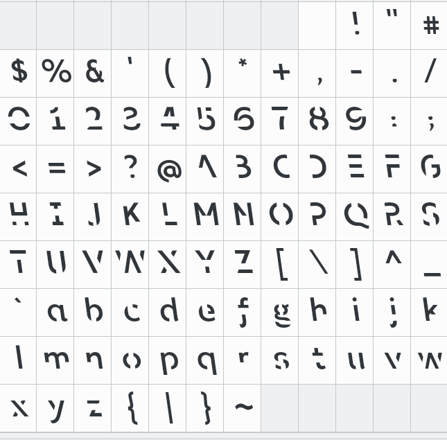
The clever people at RMIT University have come up with a font that is specifically designed to help you study … by making your brain work harder when reading.
They achieve this by slanting the text slightly left, and leaving our parts of the letters, forcing the brain to fill in the gaps.
The alphabet looks like this:
Sans Forgetica font
Only the regular weight is available for now, and you can download Sans Forgetica font here
There is another similar “minimalist” typeface called Grey Typeface, which looks like this:

Grey typeface
As you can see, it’s caps-only for now. You can download Grey typeface for free here