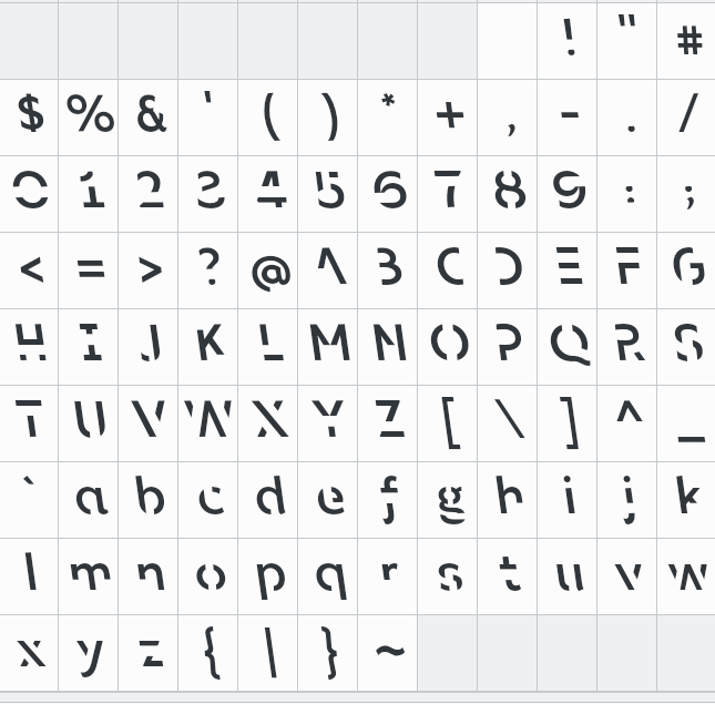
It is well known that English is a mess, mostly because of it’s diversified history, and the diverse people who have overrun England, coupled with the diverse peoples that the English have overrun. The mess creates problems for kids growing up English and trying to learn the language, as well as people coming from other language and writing backgrounds. There is just so much that is inconsistent and does not make sense. Some random examples:
- 1 cow, 2 cows, 1 bull, 2 bulls, 1 ox, 2 oxen
- 1 ram, 2 rams, 1 ewe, 2 ewes, 1 sheep, 2 sheep.
- 1 shark, 2 sharks, 1 fish, 2 fish.
- 1 rat, 2 rats, 1 mouse, 2 mice, 1 house, 2 houses.
- 1 elephant, 2 elephants, 1 hippopotamus, 2 hippopotami.
- same word, two meanings, e.g. stick, box, cleave.
- same word, different tense depending on pronunciation: read.
- same word, different meanings depending on pronunciation: minute.
- concatenation vs. possession: it’s Jack’s.
- same letters, different pronunciations: I thought it was tough, though.
- silent letters: gnome, knife, herb. (but not as bad as French.)
- stationary / stationery, to / too / two, read / red, blue / blew, whine / wine, you / hew / yew / hue (etc…)
I could go on but you get the point. But before we even get to vocabulary and grammar, we need to deal with the alphabet. Continue reading →

